Primary color palette (background colors)
The foundation of our brand identity is built on a core palette of Dark Grey and White Grey. They should be used extensively across all brand touchpoints, serving as the "canvas" for our brand story.
Color plays a vital role in shaping our brand identity. It sets the tone for our communication and creates a memorable experience for our audience. This guide provides a comprehensive overview of our color palette, ensuring consistent and impactful brand presentation across all touchpoints.

The foundation of our brand identity is built on a core palette of Dark Grey and White Grey. They should be used extensively across all brand touchpoints, serving as the "canvas" for our brand story.
Lumen5 Purple is our signature secondary color. Use this color consistently to reinforce our brand identity.
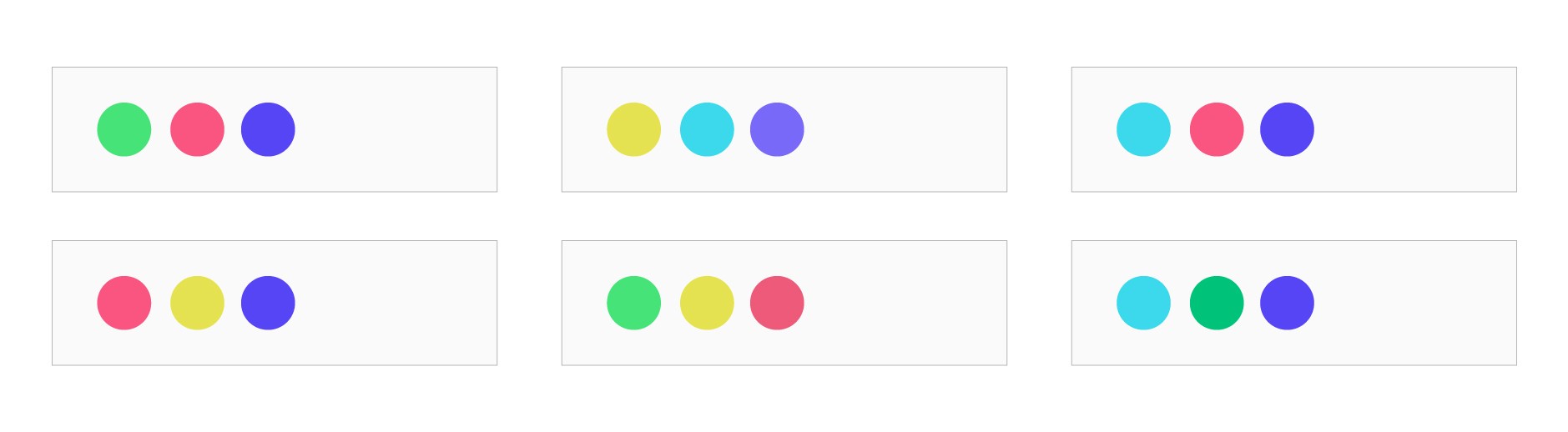
We have a collection of four vibrant accent colors that add personality and depth to our brand experience. These colors should be used primarily as accents to complement the dark grey and white core palette.
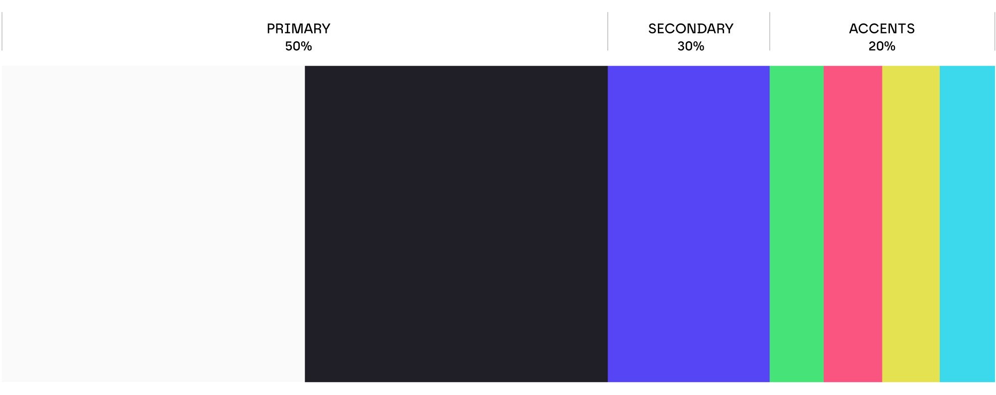
• Primary colors: 50%
• Secondary colors: 30%
• Accent colors: 20%
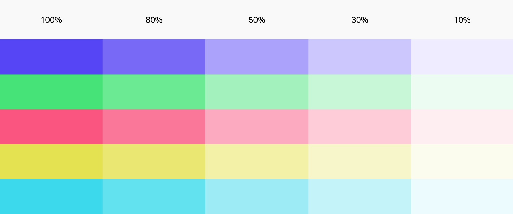
Tints and shades of your brand colors can be used in various situations to create visual interest, hierarchy, and depth.
Backgrounds: Use lighter tints for background areas to ensure content remains legible and not overpowering.
UI Elements: Apply tints and shades to buttons, icons, and other user interface.
Graphs and Charts: Differentiate data points and categories in graphs and charts using tints and shades of the brand colors.
Illustrations and Graphics: Use variations to add depth and dimension to illustrations.
Our brand palette includes nine pre-defined vibrant gradient combinations.

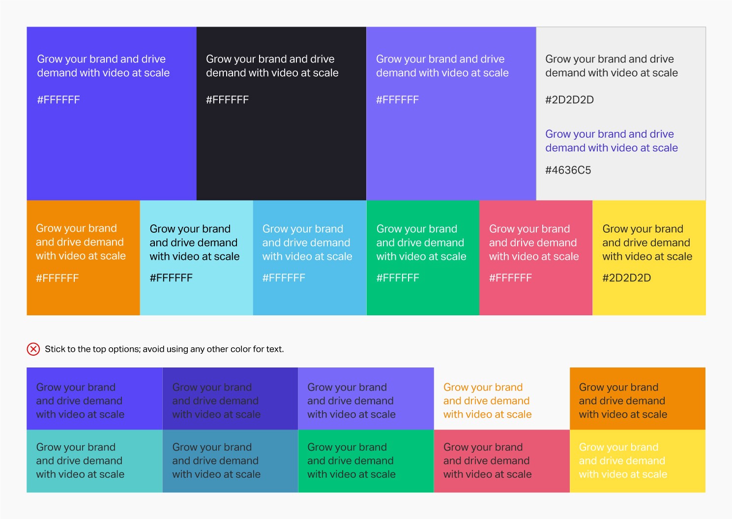
When selecting text color, we should always pay close attention to accessibility. Please be mindful of contrast by pairing dark elements with light backgrounds, and vice versa, to ensure clarity and distinction.