Typography
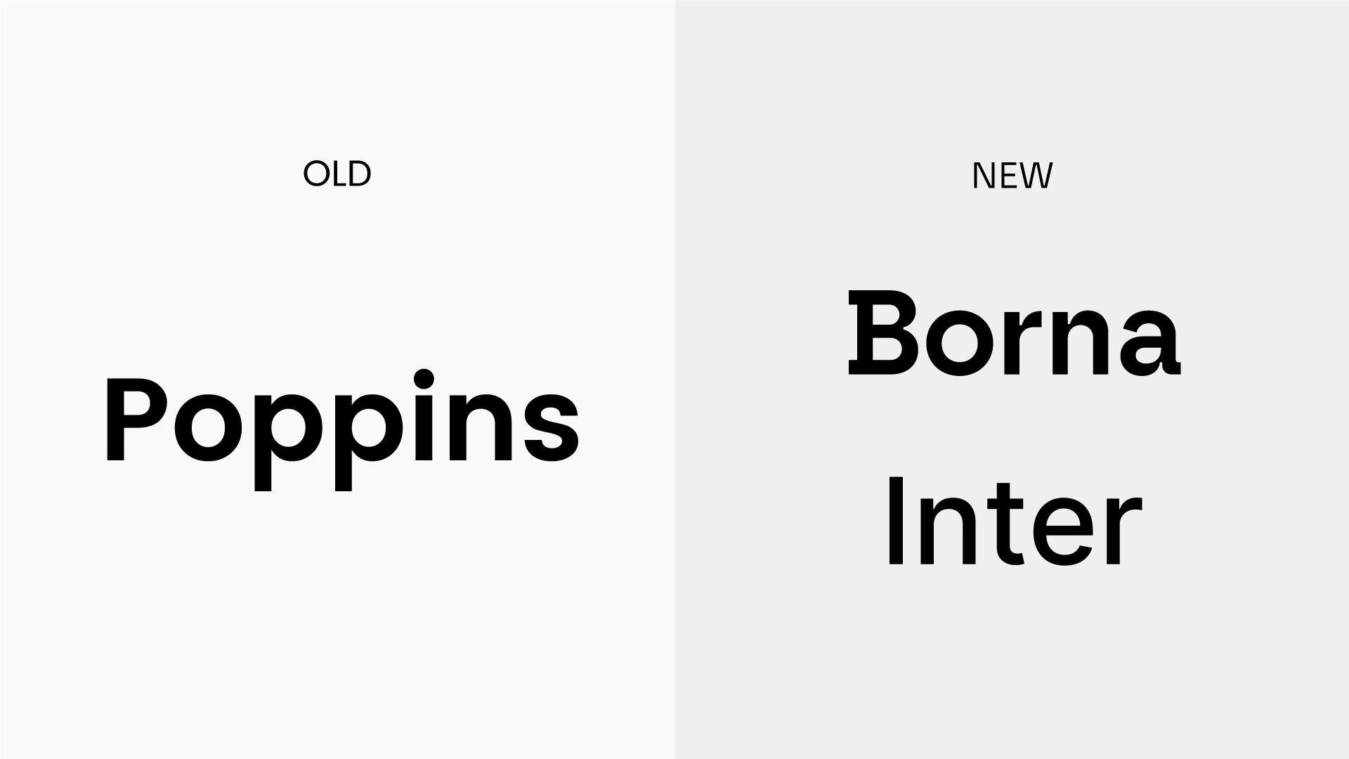
In an effort to elevate our brand image and create a more distinct visual identity, we have transitioned our primary typeface from Poppins to Borna. Borna's characteristics perfectly embody Lumen5's blend of wit and expertise. Its clean lines ensure clear and crisp communication, while the subtle flourishes add a touch of personality that reflects our playful nature.
Before and after
History and overview
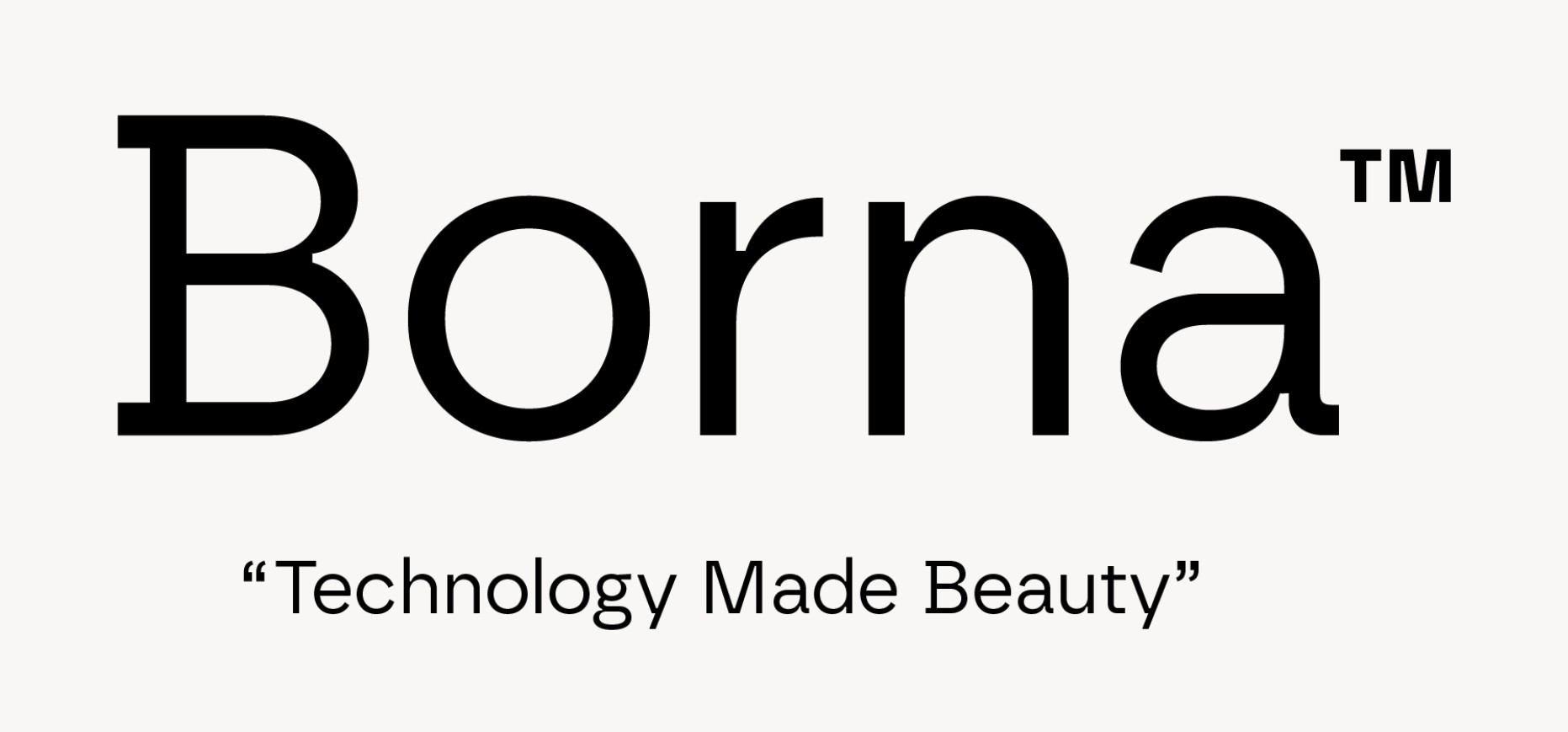
Borna draws inspiration from two distinct yet complementary typographic movements: geometric fonts and the Swiss style. Crafted by atipo foundry, Borna's design heritage reflects a modern interpretation of classic influences. Its clean lines and sharp edges echo the precision of geometrics, while the overall structure and functionality nod to the Swiss style's emphasis on legibility and neutrality. Notably, Borna incorporates subtle ink traps, a design feature that enhances its personality and adds a touch of technological flair. This unique blend of influences positions Borna as a typeface that is both sophisticated and functional, ideal for clear communication in a variety of design contexts.
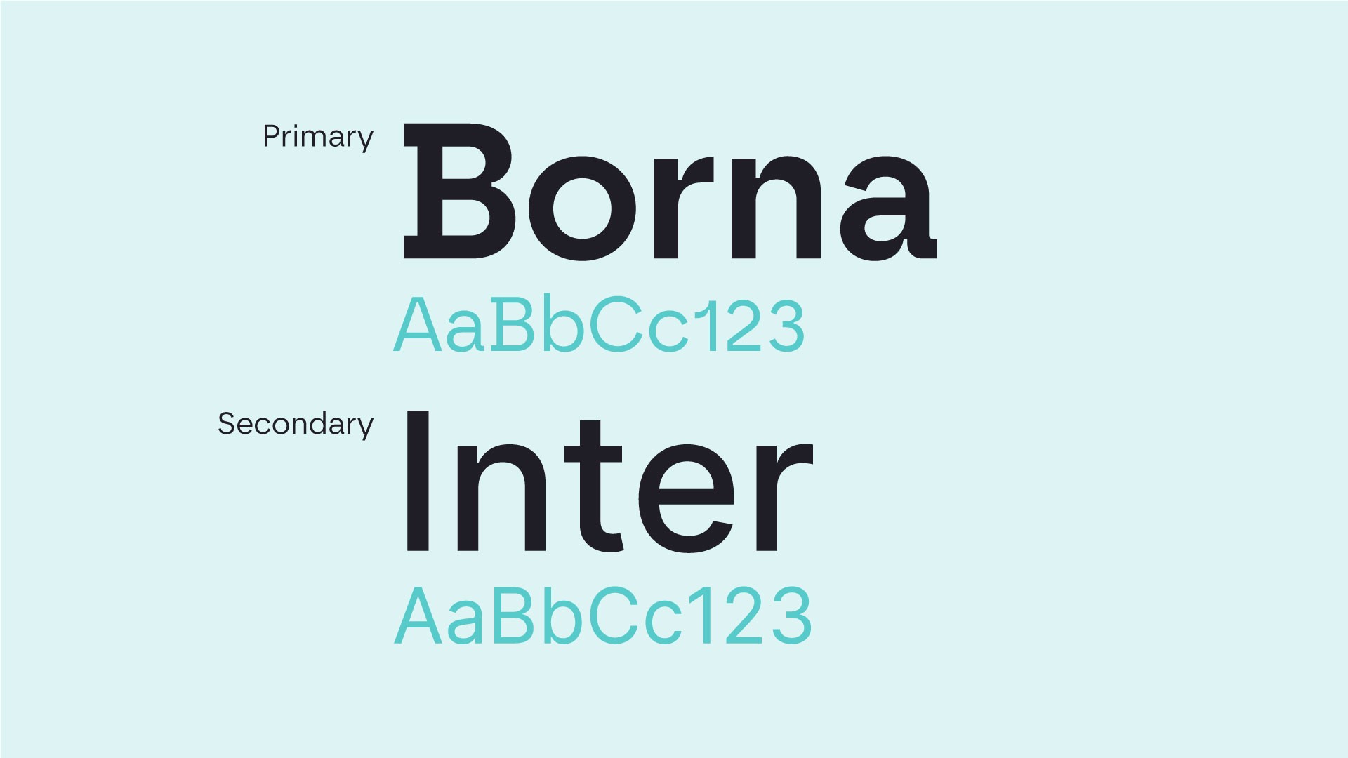
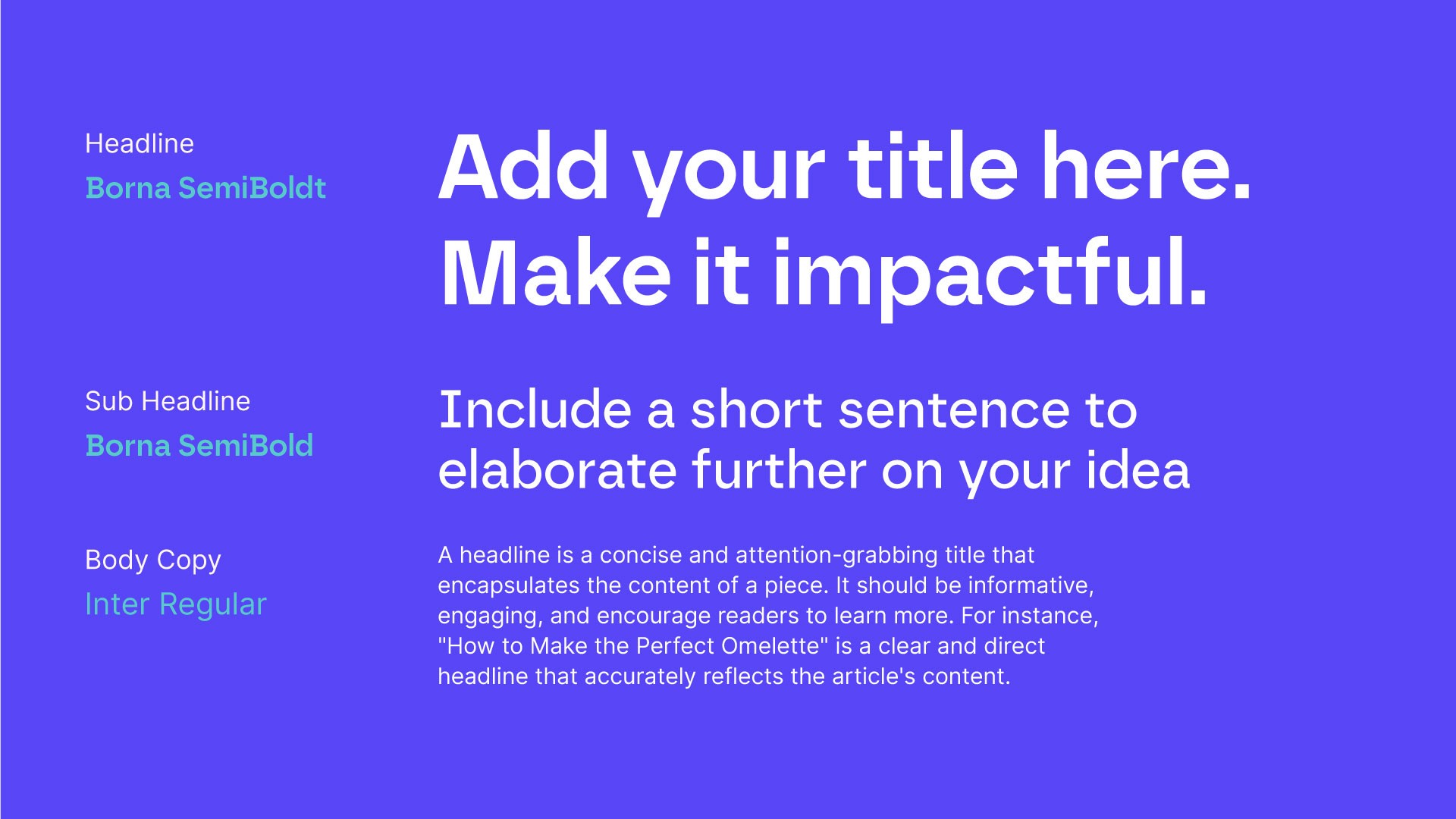
Fonts
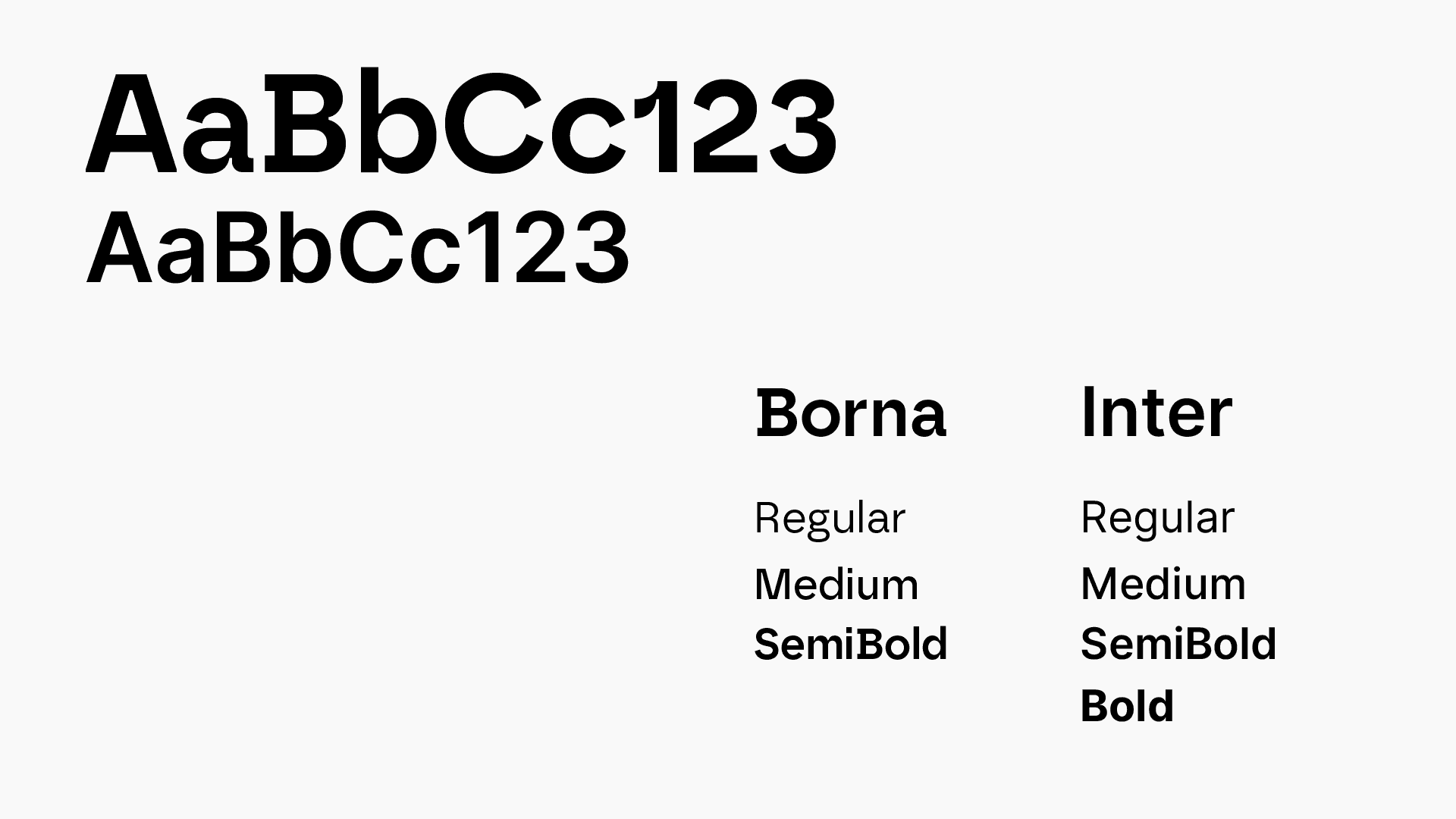
Borna serves as our primary typeface and is ideally suited for headlines and subheadings.
Inter acts as our secondary font, its clean lines enhancing readability for body copy.
Typesetting
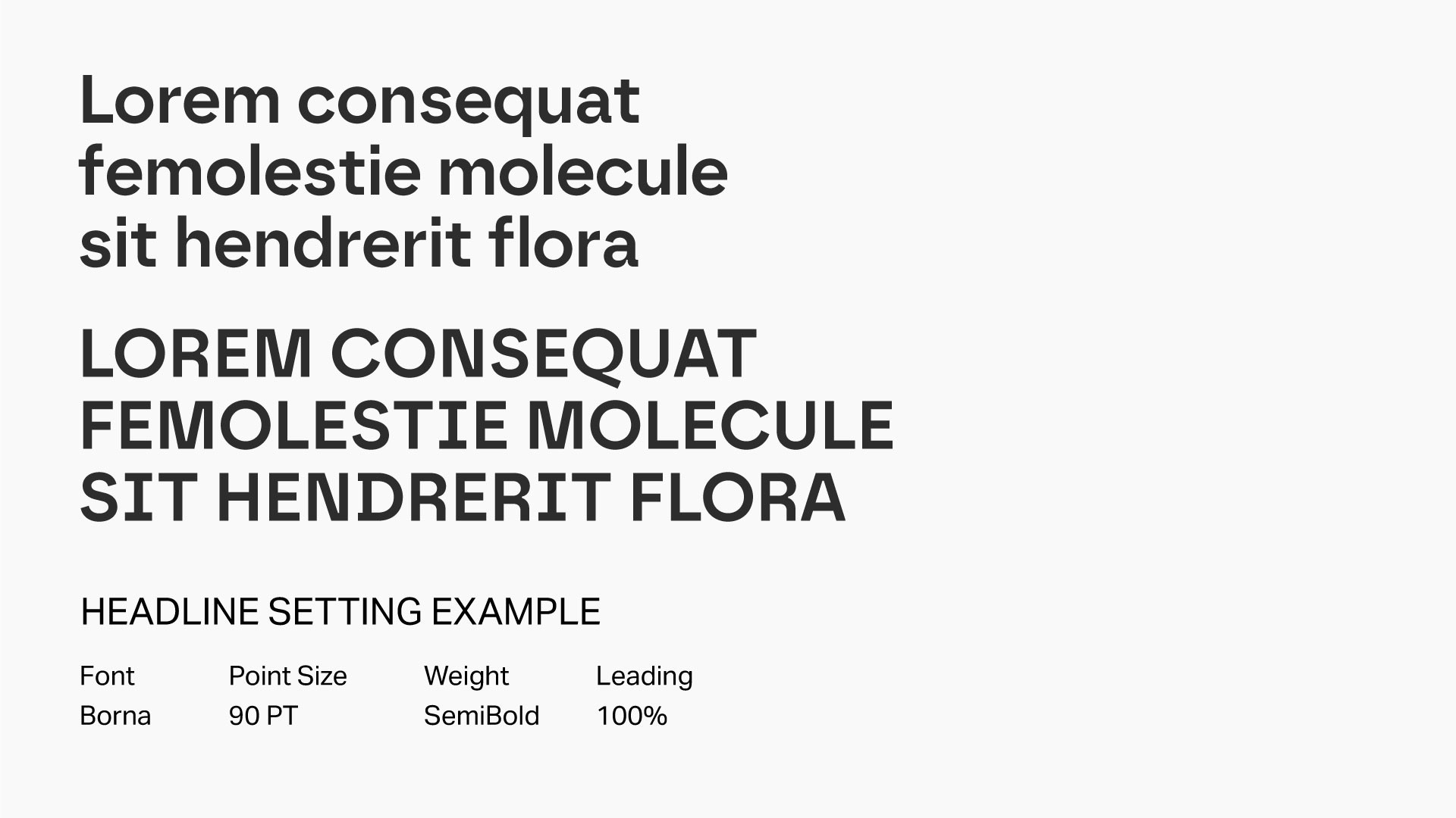
Headline settings
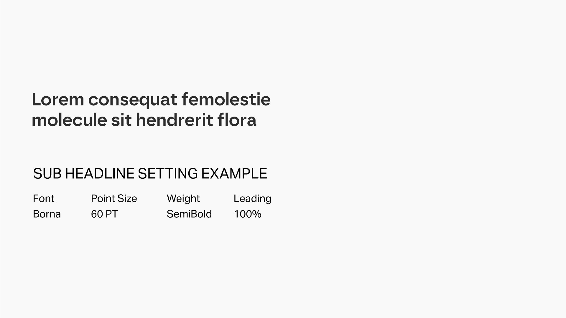
Sub-headline settings
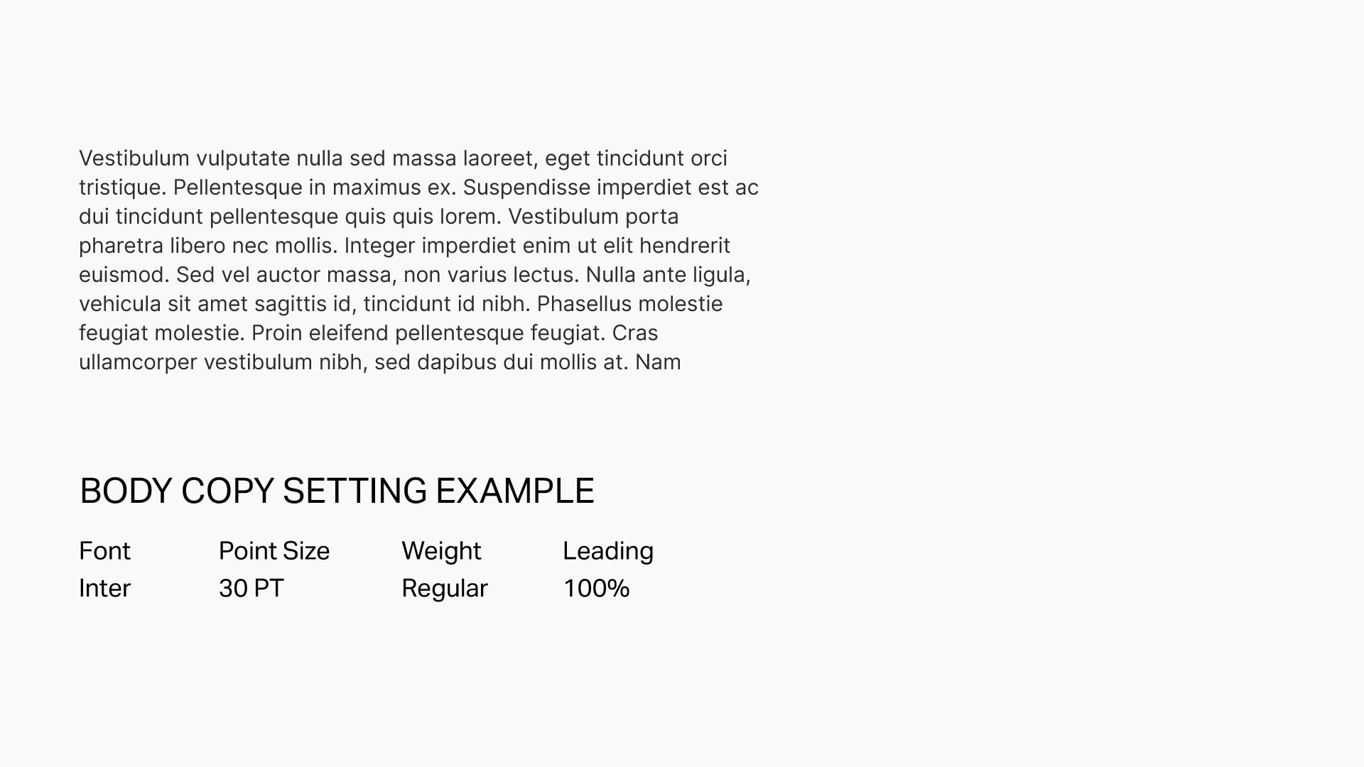
Body copy settings
Alternative font
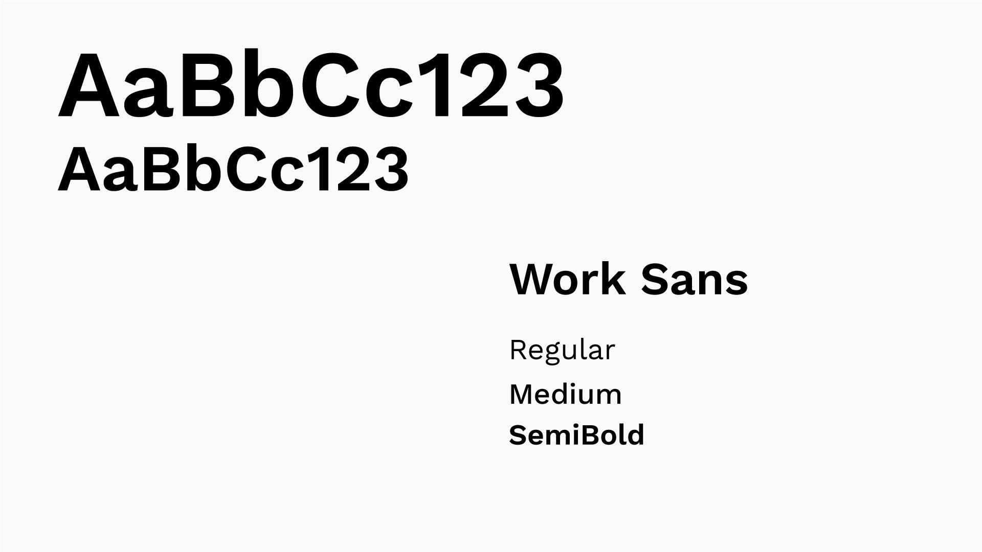
To ensure brand consistency, we use Borna as our typeface. If Borna isn't available, use Work Sans from Google Fonts for a similar professional look.
Usage: Google Slides.
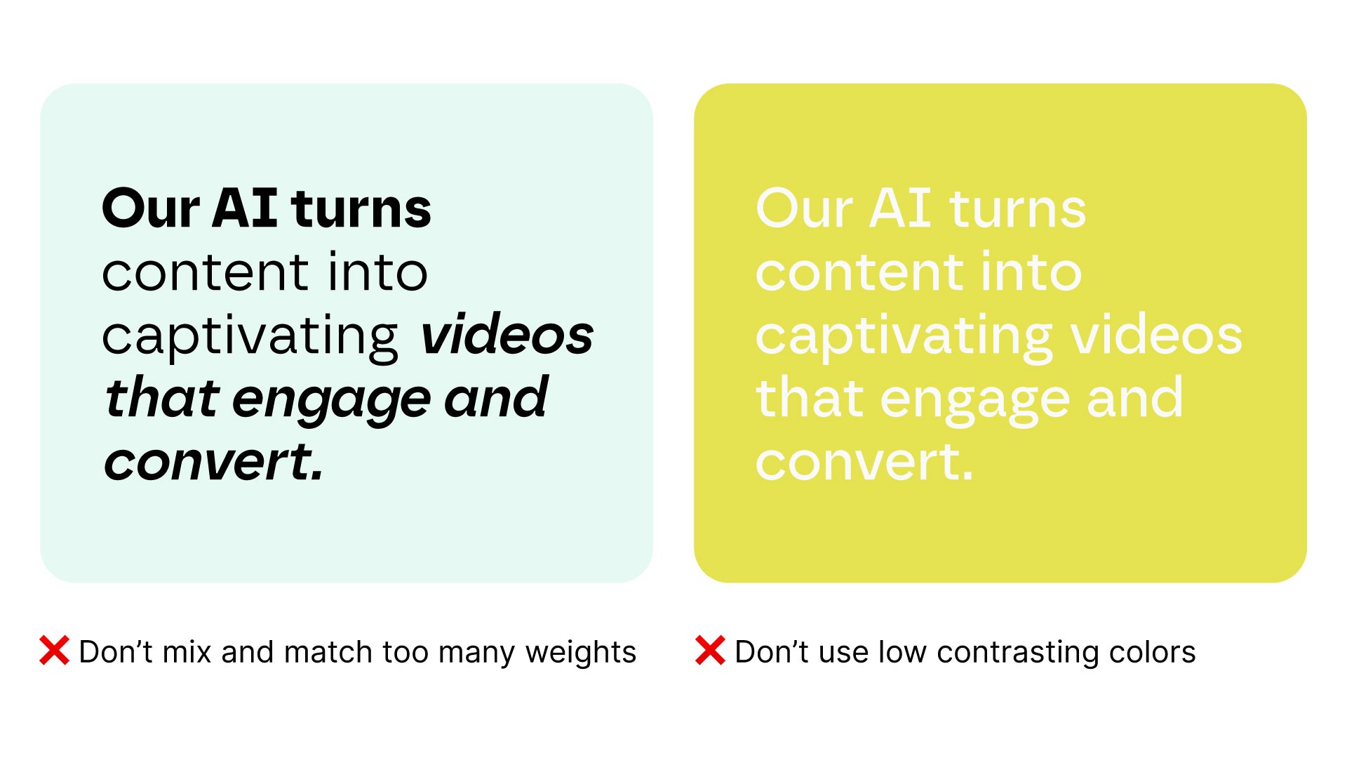
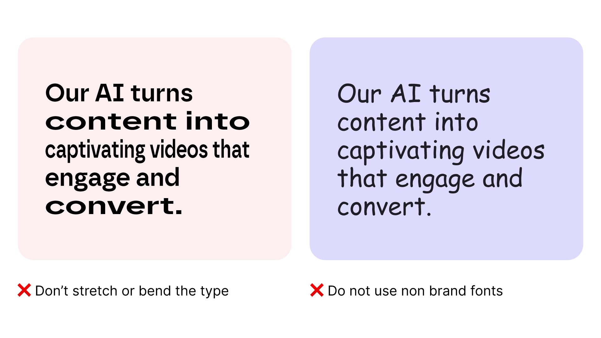
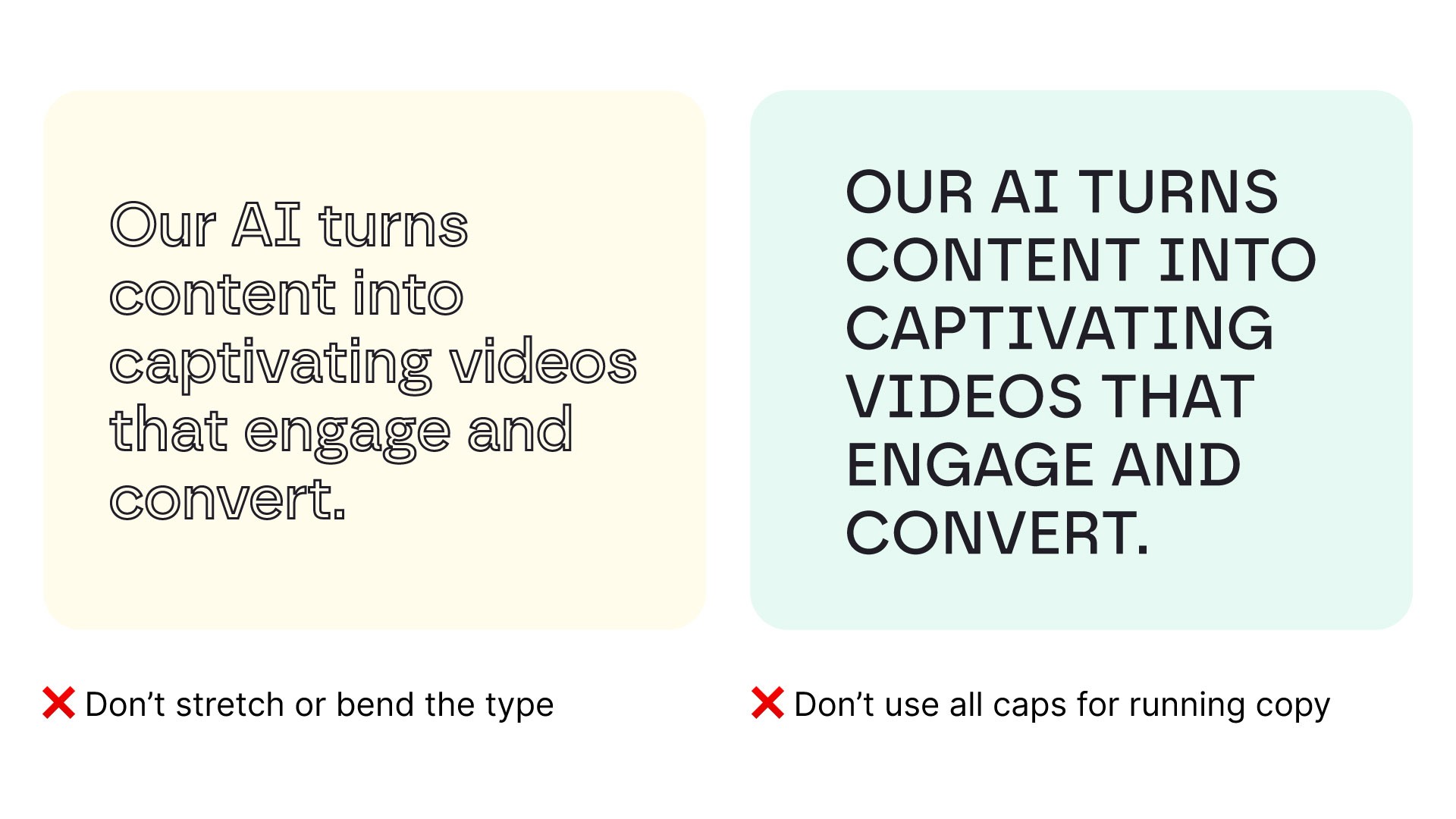
Typeface mistakes to avoid
Best of typography usage

How to apply in motion
Our brand thrives on taking risks and charting new paths, reflected in our typography animation. Confident motion with swift movements, sharp transitions, and clear emphasis on text arrival and departure are key. However, clarity is paramount, and legibility must always be maintained.

Word by Word

Push by Word

Push by Word
Caption

Lower Third
Kinetic Typography

Kinetic Typography
Kinetic Typography